Transcript
Mid values are important, because they provide body and realism. If you establish a dark value and then drop directly to light values, your mid-value-deprived drawing will look rather alien and unreal. It will lack depth and separation between planes, and three-dimensional objects such as these flower pots and watering can, will look rather flat. The wicker basket looks two-dimensional and incomplete too.
Add the mid-values and there's an instant improvement. And the bicycle now connects to the wall behind it.
Where light values might add subtlety, and darks create shadows and holes, mid-values describe the three-dimensional modelling. they add the
substance and solidity of the subject.
This is a wide-ranging area of study, and with more than one distinct method, so we'll work our way through the creation of mid-values from dark to light.
Where darks and blacks benefit from being deep in the tooth, midtones are more often applied on top of the tooth, or partially into it - depending on the effect required. Of course, if you require a perfectly smooth finish, you need to fill the tooth to eliminate the holes in your shading. So, in that case, use a harder grade to counter the darker appearance that saturated shading produces.
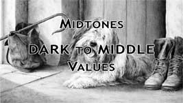
Midtones: Dark To Middle Values
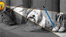
"Ready and Waiting" contains a range of midtones and a variety of methods, so I'll work my way through it - the canvas bag, old worn boots, the plastered wall, and the stone floor - and show you how each was created.
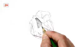
This old canvas bag was shaded with a combination of hatching and cross-hatching to subtly suggest the weave of the fabric. The hatching isn't, of course, random but follows the direction of the weave on each surface, and its values suggest the three-dimensional form. That said, I'm simplifying the job by splitting it into texture and form: concentrating on the texture first, and I'll add the three-dimensional shading later.
There is one technique I will NOT be using, so abandon all thoughts of Blending! That will immediately turn this into mud and remove the sharp edges. However there is an excellent and far more controllable alternative - and that's Layering.
In "Ready & Waiting" the crosshatching was layered with HB (with the flat face, as I'm using here) to increase the descriptive three-dimensional form. The flat face skates over the tooth and won't draw lines, or affect the existing lines. And then the next layer equates to blending without the softening of edges. I'm lightly layering 2H over each area. This is something you need to experience, because that's better than any explanation I can give you. It unifies an area. It removes any vestiges of white, and gently smoothes the graphite beneath it - without moving any graphite around; preserving the sharpness of the drawing and, as I said, it's similar to blending but far more controllable.
Try it yourself - just the technique. The subject isn't important but choose one that utilises line and most probably contains white. A section of wood grain would be a good choice. See for yourself how layering with a hard grade adds solidity to your shading and textures by removing unnatural white. Except, obviously, where white might naturally occur. Or in highlights that you want to emphasise.
Lightly shading over anything that is not white simply brightens the white you intentionally left. In this case, layering with 2H over everything except a part of the handle, ties everything together; gives a more solid appearance; and emphasises the shine on the worn metal that's resulted from many decades of use.
Midtones: Dark to Light Values
Where the bag was controlled, these boots use a more intuitive form of shading. Caricaturist Al Hirschfeld said, "Sculpture is a drawing you fall over in the dark." Where a sculptor draws in three-dimensions, we create the illusion of three-dimensional elements on paper. And that exactly describes the necessary mindset - these boots were
sculpted by pencil.
You've probably heard me say this before, and you'll hear it again and again - do not work on more than one element or texture at any time
. In this case, the boots are leather - the laces are not. So, the laces are isolated by outline and completed later. More importantly, that allows me to think "leather" and "boots" and to let my pencil sculpt their three-dimensional forms.
This isn't about SHADING, it's about SHAPING. Mentally
feeling the shape of the boot under your pencil. The curves and crests and valleys. I'm using the flat face of a 2B pencil for these boots, although I'll switch to HB for the lighter values of the toes. Lightly applied, flat face shading, working in small circles, permits you to build up each area until it looks like your mental image of it. And that mental image is of paramount importance. You must be able to both mentally picture the subject and feel its texture. This is not a shading exercise - it's the physical and solid recreation of a pair of well-worn boots.
Light creates shadows and highlights. So, it's light that visually defines the three-dimensional appearance of an object in real life. We need to imitate those highlights and shadows on our paper to make it appear three-dimensional. To succeed, you only need to know the direction of the light source and to ask one question: "Can this point under my pencil see the light? Partial light? Or no light at all?"
Imagine you're pushing your pencil point into the shadows; sliding up the sides and over the highlights to drop back down into the shade as you feel the rise and fall under your pencil. This thinking reinforces the three-dimensionality of your subject at every moment.
Let me reiterate that because it's an important concept. This point, beneath the tip of my pencil, is curving away from view between the two boots, and away from the light. Can the point of my pencil see the light? No, it can't. It's hidden way down the side of the boot, so it's in deep shade - receiving no light.
Now I'm curving up towards the top of the boot. Notice that I have no reason to pause or stop. Using CIRCULAR shading, I can shade up, down, sideways, and alter the values at will. This is a continuous process that doesn't in any way break my concentration. This area can probably see part of the light, and certainly other surfaces around this one will be reflecting some light onto it. So, it's in partial shade. I'm decreasing the pressure on my pencil to shade lighter, and heading on upwards. Now I'm absolutely certain the point of my pencil can see the light source. So, this is brightly illuminated. And, if it's directly facing the light, it will be the brightest it can be and form a highlight.
If you use this system, or develop a similar one, you are constantly reminding yourself that
this is a three-dimensional surface. And if you follow the answers you receive to your questions, you can't fail to correctly draw it in three-dimensions. However, just like a sculptor - you cannot sculpt something that you don't understand three-dimensionally. So, study your reference and extract the three-dimensional information before you begin.
Now, you're no longer shading but SCULPTING a known three-dimensional form. And, as a bonus, you can take a reference lit from one side and draw it lit from the other. Or whichever direction best suits your drawing.
As you shade, build up each area beneath your pencil until it matches your perception of it. The flat face of your point should glide over your paper and shade without a trace of line. The disadvantage is that your edges will be soft too. The solution is to guess ahead - use the edge of your point to first outline an edge, using a value, or gradation of values, that matches those you expect to use within it. Now you have both a sharp edge and a narrow safety margin. Instead of having to shade up to the edge you only have to shade up to the line. And, if you guessed correctly, the outline will disappear as you shade. If you guessed incorrectly, a sharp point or edge of Blu-Tack, gently applied, can quickly resolve the error.
Try it. Not necessarily a pair of boots - unless you want to. A scrunched-up piece of fabric would make a good subject. But whatever the subject you choose,
use circular shading. Circles are wonderful! The lines of linear shading constantly stop and have to be restarted. But CIRCLES offer freedom to explore. They can travel in any direction without breaking your concentration. And all that's needed to vary the value is to vary the weight - the degree of pressure you apply.
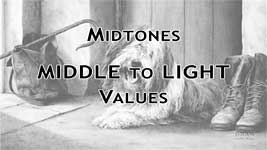
Midtones: Middle to Light Values
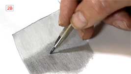
Usually, I'd advise you to never shade backwards and forwards in one unbroken line, because it leaves blunt ends that catch the eye. However, if you shade lightly, and constantly vary the length and angle, you can use that "fault" to your advantage. I'm using the flat face of an HB to produce the light tone here, which ensures my lines have soft edges that easily merge into each other.
Now I'll break one of my personal rules - I'm going to layer a soft grade over a hard grade - a 2B over part of the HB - to create the shaded section. A soft grade usually won't layer perfectly over a harder grade, so I'm expecting it to be slightly patchy - grabbing tooth where it can, and sliding over the HB where that has previously filled the tooth.
Finally, I'm lightly blending the whole area with the point of a tortillon or stump, working in small circles. However, I'm using much more pressure on the shaded area - bordering on brutal. I know from experience that really harsh blending in this situation will probably cause "clumps" of graphite to form. Usually these are unwelcome problems and difficult to remove, but here they'll add interest to the dusty floor. Incidentally, the gaps between the stone flags were drawn first and then allowed to feather and deteriorate under the shading and blending. They remain descriptive and suggest age without attracting unwanted attention.
Try laying down an area of HB or 2H and then layering it with 2B or 4B. Then blend a part of it see what effects you can create. Don't despair if nothing happens - what works for me might not work for you. And conversely, you'll achieve effects that completely elude me. Try it on different papers too - especially a smooth paper. Your paper's texture will have a tremendous effect on this type of shading, so test on a few different papers to find one with a surface texture that works for you. I'm using Conqueror Diamond White, which is plate-finish, super-smooth, and almost impossible to damage.
Midtones: Light Values
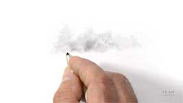
This is an oddity, because it involves drawing without a pencil, but I'm including it here because it's a VERY useful technique. If you have a used tortillon or stump and blending has left it rather grubby - that's what you need. If not, scrub any soft grade pencil on scrap paper, and then rub the end of your blender in the graphite powder. Ideally, though, use a well-worn blender with a soft flattened point. A new blender might have a point that's too sharp - but try it anyway. You never know what new technique you might discover.
Never throw blenders away, because their graphite-laden worn points are ideal for scrubbing in soft textures and suggesting far away trees and misty scenes. The whole of this area in "Early Morn at Witton Marsh" was drawn with an old blender - except for the sky, which we'll look at in the next video. I tend to favour misty scenes because - unlike painters, who can increase the blue content to suggest recession - we only have softness, and a lowering of intensity and detail. And a little exaggeration helps too.
I used a similar approach in "Connemara Encounter". But this time with a little pencil work introduced at the left, and a touch more blended pencil line within some of trees. This technique gives visual interest without it being clearly defined.
I sometimes begin with a quick sketch to guide me, but more often than not, I just make a start and let the drawing unfold. This IS paper-dependant to a large extent. I only use smooth paper but I suspect textured papers might not give as good a result. But, try it. Experimentation is
never time wasted.
Again, my smooth Conqueror can withstand a lot of punishment, so I can pitch my pressure from very light to blender-crushing. But whatever the pressure, drawing with a blender guarantees the absence of hard edges. Everything you draw
will be soft and hazy. As with any drawing tool, you can erase to adjust your values. I use Blu-Tack but a kneadable eraser performs the same operation. Just gently stroke an area to lighten it.
This is an ideal tool for suggesting soft or misty textures or objects. I use it for smooth old walls, dirt floors, and misty background trees, to name a few. And I find drawing with a stump or tortillon is often a very rewarding and free way of working, and well worth experimenting with as a viable drawing method.
This old plastered wall would be a good subject for you to attempt. In fact, you
need to physically try all these techniques, because you'll learn far more about them from the experience than I can possibly explain. And mid-values really are important. They inject solid
life into your subject.
© copyright: Mike Sibley 2020