Transcript
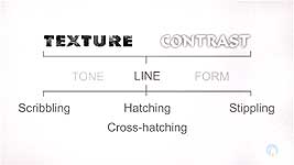
As graphite artists we only have two basic elements to work with: texture and contrast. And we only have three "tools" to capture them with:
- Tone (aka Value)
- Form (that's the three-dimensional shape and how it is affected by the lighting)
- Line
Depending on how you use it, line is both the artist's friend and deadly enemy - especially if realism is your goal.
Line allows you to build up shading in a very controlled way, or to suggest it in a free and spontaneous manner. But any hint of line remaining in a "realistic" drawing will immediately destroy all your hard work.
There are a number of shading techniques involving line - scribble (also known as squirkling), hatching and cross-hatching, and stippling. We'll look at hatching and cross-hatching, and then briefly at the others, because they are more "personal" in their use - more open to individual interpretation.
HATCHING
Let's begin with hatching. Draw a box about 1 inch by 4 inches (2.5 x 10cm), and divide it into four. Then number them 1 to 4. Now draw vertical lines to cover all four boxes. Space your lines so the gaps are the same width as your lines.
Where solid shading produces accurate and smooth transitions from one value to the next, hatching and cross-hatching create values with a series of lines. If you place them close together and blend them, the result is often indistinguishable from tonal shading. But, left as lines, they can suggest textures, and add vitality to your drawings.
Now cover boxes 2 to 4 with horizontal lines - again spacing them a pencil line width apart. A single layer of lines, whatever their direction, is
hatching. Adding lines in different directions, as I'm doing here, is
cross-hatching. You will no doubt have seen cross-hatching techniques used with pen & ink by comic art illustrators, where blending of tone is impossible. And if you have problems with drawing long lines, taper their ends and draw them in stages.
The first lines, the vertical hatching in this case, removed 50% of the white, and this cross-hatching is reducing that to about 75%. Now reduce boxes 3 and 4 even more by drawing diagonal lines. And finally reduce box 4 to about 5% white by drawing diagonal lines in the other direction. The overall coverage, of course, depends on the width and spacing of your lines. Wider gaps will allow more white content to remain.
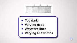
What do you see in your result?
- Lines that are too dark?
- Gaps that are too wide or narrow?
- Lines that don't follow the correct path?
- Lines that are too thick or thin?
What you see is the inconsistencies. This exercise shows you that
consistency matters! This is especially true if you intend to blend, or need areas of flat or gradated tone. Accuracy is vital. Imagine doing this again but leaving no gaps. Now you're shading tonally - and the same problem exists. Inconsistent lines will
always attract unwanted attention. So, aim to banish flaws from your shading.
In general use, hatching works better, and looks less mechanical, if the lines are drawn spontaneously. It won't look realistic but it's a quick and effective method for sketching from life. I drew this in 1963. It's the wood and pond behind my school's sports field, using ballpoint pen, and only hatching and cross-hatching. And this coat and bag were sketched from life as they hung on the back of my studio's door. It uses only line. I made notes of its key shadows and form by, again, using hatching and cross-hatching. Does it look realistic? No. It was a way of exploring a subject due for inclusion in a drawing, where I used tonal shading for increased realism.
Hatching and cross-hatching are ideal techniques for sketching. It's both quick and efficient. This sketch of my marker pen also users only hatching and cross-hatching - and no outline. It was drawn from life and only the hatching describes its three-dimensional form - and its absence creates the highlights.
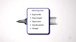
So, let's take a look at ways that help to control and minimise the inconsistencies. Hatching involves drawing lines:
- of equal width
- of equal weight
- of equal value
- that are equally spaced
- and that are straight
Equal width, weight, and value simply require practice. Spacing and straightness need particular approaches - and they are equally applicable to whatever type of line you are drawing. The secret to regular spacing is to NOT concentrate on the line you're drawing. That might sound counter-intuitive but it really isn't. Don't look at the line. Concentrate on - look at - the GAP. You're "drawing" a white line between the existing and new line.
Look at that white line. The feedback from your brain to your hand will be focused on the width of that line, and not on the line you're drawing. Try this: Draw a line. Then draw a second line, as you look at it, as close as you can to the first line. Now do that again, but this time look at the gap. You will find you can draw them much closer together - because, once again, your focus is on the width of the gap.
Drawing straight lines can also be a problem, but there is a solution. Do you drive? Then you already know the answer.
Look at where you're going and not at where you are. When you drive - or walk - you don't look at the road immediately in front of you, or at the front of your car. Looking at the road in front of you means you'll have to pause or slow down to make many major changes in direction. Look ahead to where you're going. Now you'll make minor, instinctive, changes to your direction, because you know where you're going.
SCRIBBLING
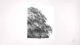
Unlike the more formal hatching, scribbling - or squirkling - is an entirely free and spontaneous method of shading. To be more accurate, it's a method of producing texture and form at the same time. It's a lovely and relaxing way to work, which I find perfect for rust and midground trees. I can "feel" my way through the masses of foliage - creating shapes, holes, shadows, and features as they occur to me. Scribble generates textures and drawing full of energy and excitement. Because it's a technique that's very personal to every artist who uses it, I won't cover it in depth, but I can thoroughly recommend that you experiment with it. You won't be disappointed. As I said, I use it for rust, and midground trees, but it has many other uses too.
STIPPLING
The final technique you might like to investigate is stippling. This method uses the drawing of small dots, and it's best drawn to music with a steady beat - and I'm not joking! It really does help to generate a rhythm.
The more dots or marks you place in an area, the darker that area becomes. Over that I place a light layer of 2H to dull the white content. It ties everything together, and gives a more solid appearance. I find this most effective if make a few marks and allow them to suggest the three-dimensional form they're creating. Then I'll take over and refine that area, before moving on to the next. That way, I'm constantly creating forms I recognise, so they're almost guaranteed to look realistic. If they make sense to me, they should make the same sense to everyone else.
For anything but small areas, stippling takes much longer than other forms of shading, but it can be very useful at times, especially for textures that it can suggest, such as mortar, sand, or any gritty surface. Or rusty metal, such as pitted cast iron.
Whatever texture you have to draw, think about which method might best suggest it - be it Stippling - Scribble, which is a lovely, free, and spontaneous way to create many textures where tight detail is not expected - or Hatching.
This is a trip down Memory Lane for me - drawn during my art college days way back in 1966 - with a mapping pen and ink.
© copyright: Mike Sibley 2018