Workshop Plus
WORKSHOPS 2018
UK, USA and Canadian Workshops and Online Course continuations
Jamie (Online - Intermediate)
Intermediate course 2017 - not that you’d ever accuse me of it, there has been no dilly dallying on my part. In fact, the world of art has been opening up for me in unforeseen and marvellous ways.
It’s a little overwhelming to be honest. In part, because you have been such a big influence on my development, you are both to thank and to blame. But the blame is only in good humour. ;)
It’s a little overwhelming to be honest. In part, because you have been such a big influence on my development, you are both to thank and to blame. But the blame is only in good humour. ;)
 Well done, Jamie! And 1½ years late is nowhere near the current record of 4 years!
As for the blame - I can live with it :o) If I've helped in any way, that pleases me greatly. I was both amazed and dumbfounded by the brick wall I met from other artists when I first started, so I determined right back then to share. If you can make use of it, then I'm thankful for that.
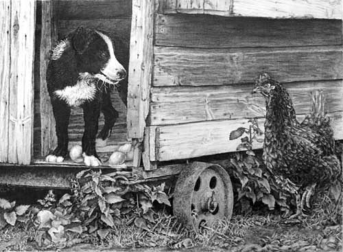
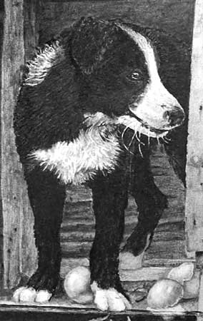
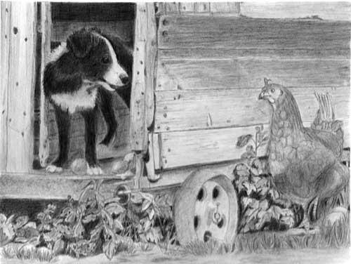
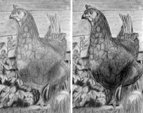
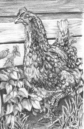
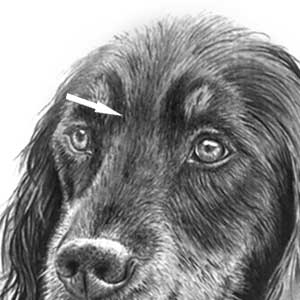
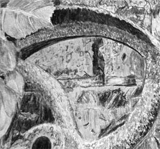
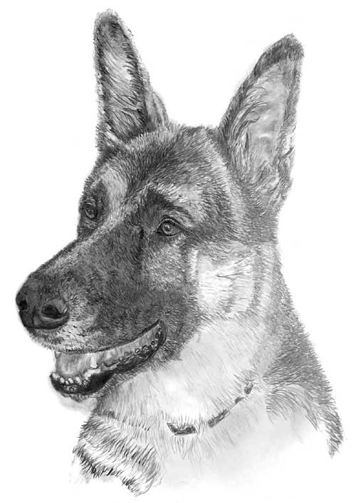
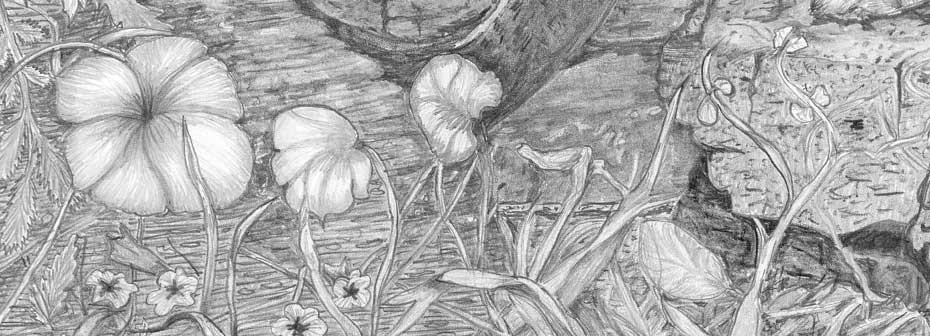
The first thing that struck me is the super contrast you've used. It adds so much presence and three-dimensionality, and it gave you a much broader palette of greys to work with. It's also created the maximum contrast where it was needed - my eye is always drawn to Robbie first. And his gaze takes me to Henrietta the hen, so both characters share the limelight.
Let's start at the back and work forwards. Your dark interior of the henhouse works well, adding depth to the drawing without overpowering Robbie. The drawing of your wood is excellent with a believable and subtle texture. It's so easy to over-detail such a secondary element, so you did well to avoid that. The same applies to the nail heads that are obvious but not distracting in any way.
I pulled certain areas of the composition aside and worked on them repetitively until I felt comfortable bringing the learned insights into the finished piece. You can see the differences in the white locks on Robbie’s upper shoulder and neck...compared to what I was able to achieve on his chest, which was done a far later date.
 There is a visible improvement. But far more important was your decision to experiment away from the drawing. I've seen so many good drawings ruined by repeated "trials" carried out within it. Yours was a most excellent decision, and one I heartily congratulate you for.
Robbie looks hairy and black, and you've done a good job of lifting his ear clear of his head. You've also correctly placed his rear paw in the shade, which is something often omitted by other artists. He's sharp, textured, has a lovely bright eye highlight, and his cheeky character is unmistakable.
I must mention the eggs too. I'm assuming you used a hard grade to shade those, because they are definitely smooth and have a subtle sheen. The highlighted edge of the broken egg works superbly well. And the running yolk is a lovely creative touch!
I think Henrietta doesn't stand out enough from her background particularly around her head. If I were to redo this piece those background boards would need to be a value lighter.
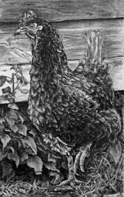 Possibly. I agree Henrietta is partially lost against the boards, but I think the solution is much simpler. Instead, consider lightening her comb and beak, and adding highlights where possible. That would increase the contrast in that area, where lightening the boards might decrease it. And that extra contrast would attract our attention to her, as the high contrast does to Robbie.
...or, and this is a fun idea, would be to turn her into a white hen. I realize afterwards, I was practising drawing her against the white paper instead of the already established values of the hen house background so the carry over suffered from that. Oh well, lesson learned.
As you're fully aware, I preach "background first" so the foreground subject exists within an environment it can both react and refer to. Lesson leaned indeed! :o) Your idea of converting her from a brown Warren Ranger to a White Sussex is first-rate. Not necessarily because it might provide the solution, but because, in your mind, you've made this scene "yours" and not mine. It's a composite composition. It never existed in real life. So feel free to make whatever changes you think are suitable or necessary. This is, as I'm fond of saying, your world. You're the master of it and you make the rules.
That said, I think the drawing of Henrietta is very good in many respects. I usually council against over-feathering, but you've succeeded in giving her a generous coat of feathers while both describing her three-dimensional form and not having the feathers dominate. And the lighting of her raised left foot really captures the only movement in the piece.
I’m not completely satisfied with the foreground around Henrietta. I'll need to go make some studies of rocks, dirt and such.
It always amazes me how much information we artists pick up from the world around us. Although, I shouldn't be surprised because drawing is such a detail-orientated medium. So, look at some dirt, but I think you'll slowly add to your mental store of information anyway over time. It's inevitable.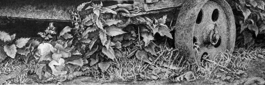 Some of the edges in your grass are, as you mentioned, a little soft. But you're aware of it, so that's all that matters. Something to carry over to the next drawing. The grass itself works really well. It has depth and, more importantly, some blades curving towards us, and it's rooted in the ground, not just springing up from it. It does its job very well as it is.
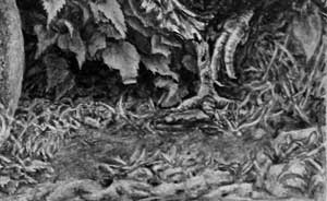 I don't share your dissatisfaction of the ground beneath Henrietta. The bare patch gives her a natural space to run into. And the extreme bottom right foreground works perfectly well. It's not sharply defined, but that has the benefit of it not attracting the eye away from the hen.
As I've learned over the years, not everything is immediately understandable in Nature. Sometimes it's not understandable at all, yet we still accept it as being natural. I see this area as being a broken piece of ground that, owing to its lack of definition, requires no exploration.
Sometimes I was wondering if I was over detailing things a little, but I have had extensive feedback on this piece, and listening to remarks, Robbie and Henrietta are clearly the focal points of the drawing, even though there were a few people who had to try and touch the boards to see if they can feel the texture. That always makes me laugh.
First, I don't detect any over-detailing at all. Not even in Henrietta, where there is possibly more detail than was necessary, but it works well. As for "touching the texture"... I've had that happen too. Yes, it's funny... but only after I've recovered from the heart attack :o) Thanks for joining me at Drawspace, Jamie. You should be justifiably pleased with this result, and I hope I get to work with you again some day.
Tricia (Studio October - Drawing Animals)
Tricia here from the October 2018 Drawing Animals workshop. I'm sending along two pieces for your critique. The first is a horse - I showed this to you during the workshop when it was a work in progress.
 There are a couple of points I want to mention, and one concerning the horse, but none relate to the quality of your drawing, which is excellent.
Your horse has a texture that I can feel. And a solid three-dimensional sense that I can immediately understand. The mane is super - completely different in texture from the coat, which is both entirely natural and not easy to achieve. He - I cant tell, the rear end is missing :) - has a lovely kind expression, and a bright eye highlight that immediately draws my attention to him. The only negative is your choice of reference that displays camera lens distortion. It makes his head look unnaturally large. But, that said, I don't dislike it for that. It could even be argued that it provides a certain charm to the study.
Outside of the horse, one aspect does bother me, and it's almost the first thing I noticed. The horse's shadow extends way too far back. Even if it looked like that in the reference, I'd still choose to alter it. Most probably I'd gently fade the shadow out - so the legs cast a shadow to ground the horse, and then quickly disappears, having done its job.
Judging by the scale of the distant fence, there is perhaps 50 or even 100, yards between horse and fence. Even at 50 yards, your shadow is only half way up the body at the 20 yard point. At that distance, I think it would be so diluted by sunlight as to be invisible.
Finally, I really like your use of negative drawing within the grass. It sharply separates the foreground blades, and defines the top of each layer as it recedes. It's unmistakably lush grass, and very well drawn.
I gave the cat portrait a black background. I don't think this is something I would do very often but it seemed like the right thing to do in this case, given the cat's somewhat menacing expression.
 I've been owned by a lot of cats over the past years... and this boy is probably the grumpiest I've seen :) Even grumpier than my old grey Benny, who looked very much like your cat.
Assuming the cat was grumpy, and that you intended to depict his grumpiness, you've succeeded wonderfully well!
The black background, which I too very rarely make use of, suits the subject. It pushes him into the limelight and definitely adds a sense of menace.
There's nothing I don't like. The hair texture is immediately recognisable, his ears have depth, his eye are glassy (and intimidating!), and his mouth says everything it has to say - namely: Grumpy!
Concerning technique, approach, and composition: there's nothing I would do differently. It's a lovely drawing.
Andy (online - Intermediate)
I am amazed it turned out as good as it did as I had a couple of major issues with it. One is I almost ruined Henrietta the Hen.
 I'll mention Henrietta later but this has a lot of good points - and a few that could be improved :o)
 Robbie is decidedly hairy, three-dimensional, and welcoming. His nose is lacking highlights, which makes it look rather flat, and the highlight in his eye is rather dull. Personally, I would have isolated (outlined) that highlight as my first move and stayed well away from it. With the adjacent black pupil, you have the maximum contrast in the drawing right there in that small area. It's almost guaranteed to grab the viewer's attention.
You've introduced a slight upward curve to the end of his mouth that suggests a cheeky human grin, and that works really well. Reflected light along his back separates him from the dark wall behind; and his rear paw is in the shade, which is something many artists on this course overlook.
Henrietta the hen started out great but I overworked her, and then she just look like a grey blob as I tried to fix her. After an intense night of working on her, I was able to at least make her look like a chicken and stand out from the chicken coop.
 She does stand out from the henhouse now, so your extra time was well-spent. However, there are two players in this story of equal importance, but your Robbie the dog dominates the scene. Henrietta needs to be promoted. First, ignore whatever the reference tells you about her colouring. This is a composite scene - it never existed - so feel free to make whatever changes you think will help to tell the story. Instead of being the red Warren Ranger that she was, she could equally be a Buff Orpington, or even a White Sussex. It's your world you're creating, so she is whatever you decide to make her.
My solution, which might not reflect yours, involved four steps. I increased the overall contrast, which gives Henrietta a presence and helps to display her concerned expression. Then I created a bright white eye highlight that attracts out attention to her. Her raised foot has been lightened, because it's the only movement in the drawing and important to the story. We don't know if she's paused or running, but emphasising that foot creates a degree of tension. And, finally, I darkened the underside of her body and blurred that distracting hard, dark edge across her chest. Other than that, I haven't altered any of your drawing of her. You've chosen a good and subtle degree of feathering - enough to tell us she's feathered, but not so much that it distracts.
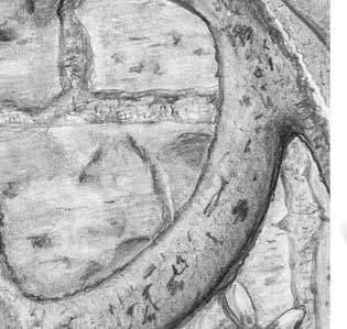
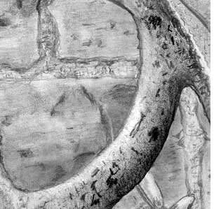
Outside of the two characters, the wood of the henhouse looks old and weathered, although the edges could have been sharper, and your nail holes are varied and natural, without them attracting too much attention. The rusty wheel is rather light, and it has a problem. The top of the rim's outer ellipse is flattened, and, down its left-hand side, there's no indication of the rim having a thickness. Small points, but they make a big difference to the perceived sense of reality.
Not sure I like all of my lighting especially on the plants and of course my worst enemy grass. But at least this grass is better than my grass has been before.
 You gave yourself a problem with the foliage as soon as you completed the shade beneath the henhouse. It's relatively light and appears to be full of holes from the paper's tooth. Try 2B and then burnish that with HB for hole-free, solid darks. Do that and you then have far more values available for the foliage, and you can push some of it much further back into the shade.
As you draw, ask yourself what's happening. Given the lighting direction, is this leaf on the bright or shady side of the stalk? Is it being shaded by another? Is it casting its shadow on a lower leaf? Is it in the foreground or perhaps underneath the henhouse in the deep shade? Draw what you understand and everyone viewing it will understand it too.
 The foreground does its job very well. It has detail if I look into it, it leads my eye in, and it's not over-detailed or distracting. The grass, however, is all positively drawn. That restricts you to midground and background blades only. Use negative drawing for the foreground blades. It's the only way (other than erasing) to create light blades against a darker midground. That's all that's missing in your grass - none of it is front and bends towards us.
Overall I think this a good result - especially for a subject that was designed to stretch you.
Elizabeth (online - Intermediate)
I used one of your templates for the drawing which made me feel like I was cheating, but, man, it made it so much easier. I must work on being able to do a nice light outline of a drawing first. without that one starts out with a handicap. Also, your breakdown of how to handle the drawing was super helpful and again, made the task a lot easier. Thanks very much for the course. I have a long way to go, but at least I am pointing in the right direction.
 I'm glad you found the pre-drawn template useful. Using it was definitely not cheating! If you'd personally spent time planning it all out, the result would have been almost identical - so, using the template simply saved you that time. With the obvious difference that you can't erase any of the template lines :o)
It's a very commendable drawing and well-executed. There are areas that could be improved, which I'll cover, but the main elements are drawn well. And you are definitely heading in the right direction.
The wood textures of the henhouse nicely describe the old weathered surface, without it fighting the primary elements for attention. It's tonally very well judged and has a heavy and solid feel about it. I think your nail heads are probably too prominent and distracting. The values you've used for the right-hand wall make the hen stand forward, which is something many artists on the course have struggled with.
Robbie is looking cheeky and alive - very mischievous and wearing a big grin. He has good three-dimensionality, and a sense of him being hairy. The strong darks you've used give him lots of presence, despite the necessary dark values inside the henhouse, which he successfully dominates. His eye highlight is rather low, and it's not as brilliant white as it could have been. It still grabs some attention, but you lost the benefit of having the white highlight adjacent to the darkest value in the drawing - his pupil. That would have created maximum contrast and drawn the viewer directly to him. Also, you didn't darken his rear paw. It's inside the dark interior, and probably in Robbie's own shadow too.
I feel like I made a real mess of the chicken and don't have the definition of the feathers at all. I was wondering how you would handle the fine feathers where the breast meets the back, the fine feathers overlap the back, but the background feathers go in an opposing direction. In the end, I muddied it and had to shade over.
 I think you were trying too hard. Personally, I'd minimise the feathering as much as I could, except for a small number. Those I'd use to show that she is covered in feathers. More correctly, it's often not the feathers we see but the splits in them, where the filaments have parted. So, I'd use a few of those edges to say "these are feathers, so assume everything else is too".
You were so focused on drawing feathers that you lost the three-dimensional form of her body. And her legs are lost in the detail too. That's unfortunate, because her raised foot is an essential part of the story. We don't know if she's running or has paused but she does add tension, and implies the only movement in the composition.
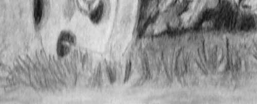
The rusty wheel looks smooth but with a subtle and natural patina of rust. It's very well drawn, and I like the way the base disappears into the surrounding grass. You've had a really good try at using negative drawing for the grass, and it partially succeeds. What those clumps are missing is foreground. They have blades of grass growing upwards, and others bending to each side, but nothing is growing towards us. The result is that we can see where every blade springs from the ground, which isn't natural.
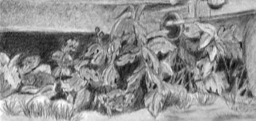
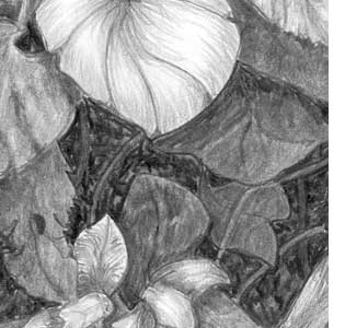
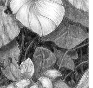
 That brings me to the foreground foliage. It's has an excellent diversity of shape, and all your edges are sharp - it's what the eye expects to see in a foreground element. But you have lost depth.
You've created layers, but they're either foreground or midground. You could have created a lot more depth by pushing some leaves back into the shade beneath the henhouse. That area on the left, beneath the henhouse, looks more like a dark curtain - because nothing intrudes into it. Also, almost all your foliage is devoid of cast shadows. I'd expect at least a few leaves to cast their shadows on those below, and that too would create depth.
Apart from some aspects of the drawing, that I'm certain will improve as your store of observation and memories grows, I think you should be justifiably proud of this, especially as it was intended to stretch your abilities. Thanks for joining me at Drawspace.
Liz (Ottawa workshop - August)
One thing I notice, after putting up on here, I need to darken the head, to form more rounding and side shape! I’m happy with the eyes and nose, still needs work on the chest hair to soften! Thanks so much for your sharing of your talents in the workshops!
 The nose is looking really good, Liz. It has form and texture, and the highlights reinforce its three-dimensional nature. I would, however, dull the light portions of the join from front to back at the right. It's currently fighting for dominance with the main highlights. The same applies to the rest of the head, but I'll return to that.
The eyes contain a lot of good work too - especially the right-hand eye. The left-hand one doesn't quite read correctly when both eyes are compared. The pupil is larger, and I think the key highlight is possibly too high. Establishing a reflection across the top of the eyeball, as you've done for the right-hand eye, will probably correct that over-sized pupil. And darkening the top of the eyeball will help to. It will be in the shade of the brow above, which yours isn't.
 You mentioned the need to "darken the head, to form more rounding" and you're correct. I think the problem here is that the head contains too much white. Some of that might be the result of the exposure corrections I made to your photo, but I suspect white is present.
Reserving white for you main highlights will work well, but only if white is not present elsewhere. When the white is dulled in all areas except the intended highlights (as I've attempted to show you), the highlights regain their importance. For example, I muted the white of the eye, which isn't naturally pure white, and the highlight running around the bottom eyelid. The only white in that area now is the eye's key highlight, which shines with more brilliance. Try shading over the entire head lightly with a 2H. That will dull all the white content without altering the darker values. The overall effect is to tie everything together. It provides a solidity that white gaps don't achieve.
 Something else you could try, in order to improve the three-dimensional shaping, is to enhance the "stop". That's the change in plane that occurs to the dog's muzzle where it slopes up to its forehead. This is one area where a little exaggeration is often worthwhile. It subtly divides muzzle from cranium, and provides that change in angle between the eyes.
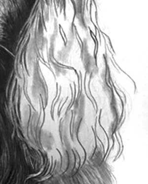 Something I feel I should warn you about is applying "trial" tone. I understand that you are defining the darker areas of the ear before you begin work on it but... you are removing white as a viable value in those areas. And you're doing that before you know where any white might be beneficial. You can, of course, later erase to white, but erasers rarely restore the pristine white of untouched paper. If you need to map those areas, use light hatching with a 2B, which can be completely removed with Blu-Tack, or a kneaded eraser, without causing harm to your paper.
Finally, consider lightly blending the top of the head as it curves back into the distance. That will provide the expected softening of detail and improve the recession.
Overall I think you've injected a lot of character into this Gordon Setter, and succeeded in differentiating highlight from the tan marking, which isn't easy! I'm looking forward to seeing this completed.
Liz - update
... thinking the highlights on the ear might be too white! But.. happy!
 You've every right to be happy... Reg has character! He also has ears that appear to be flatter than might naturally be the case.
I agree that the highlights in the ears are too bright - but not for the reason you're probably thinking. I think they appear to be that way because the majority of the mid-values are missing. That results in a major shift in contrast between the predominantly dark ear and the bright highlights.
While I think of a solution :)... you've softened the top of the head, which definitely increases the sense of depth by making the skull curve away out of view. Reg also has a stop, which was missing before. Previously, the top of his muzzle travelled from nose to forehead in one unbroken slope, but now he has that expected steeper change in plane between his eyes.
Something that I didn't previously mention but should have - you've succeeded in splitting tan hair from black hair without the tan hair looking like highlights in the black. That's not easy to achieve - well done!
I'm aware that what I'm seeing might not accurately represent your original. It is, for example, quite probable that returning the background of your photograph to white affected the lighter portions of your drawing, and that my attempts to correct that might have produced excessive contrast. With that in mind, I'm not going to comment on the nose, eyes, or body shaping. In all probability, they're looking good.
 I'm convinced that the problem with the ear is not the highlights but the absence of mid-values. I'm deliberately not looking at the reference as I write this, but I strongly suspect there are bands of highlighted hair that run across this ear.
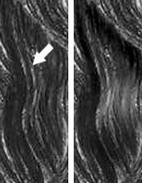
I can see from your earlier photo that you shaded the areas destined to be in deep shade. Ultimately, you appear to have made many changes in that plan. The result is that you have areas of deep shade between hanging locks of hair, but the locks themselves are very dark too. For example, the values of the highlights of the arrowed lock (below) are similar throughout its length. And it emerges from beneath the lock above, but the upper lock doesn't cast a shadow on it, or even darken those highlights. That results in a loss of depth.
 In addition, that locks curls out and back in again, yet its values don't reflect that. Their similarity from top to bottom suggest it's flat. However, in reality, a short distance from the top it curves out towards us. More importantly, that curve presents the surface to the light. Then it curves back away from us, and away from the light. Add those subtle highlights and it takes on its true three-dimensional form. And, the bright highlights you created now don't look out of place.
As I said earlier, I'd expect a glossy ear like this to exhibit bands of highlights that run across it. Those are simply created by establishing individual highlighted bands on each lock, such as I've just described.
Keep the direction of the light in mind at all times. And think about the three-dimensional form of the lock you are working on. Ask yourself "Will this area be shaded by another?" "Is this curving out to catch the light?" "How much light will reach this piece of hair that is visible in this shady gap?" Keep asking yourself such questions and you'll very quickly build a believable reality into the drawing. And you'll create a lot more depth too.
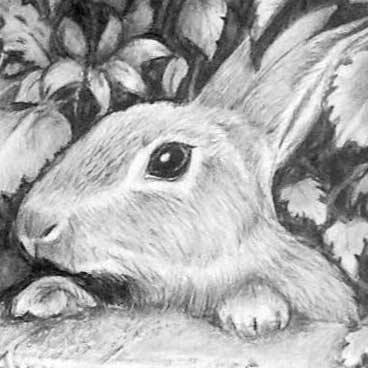
Michael (Florida workshop - August)
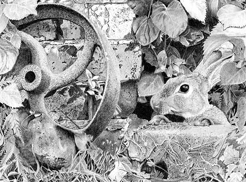
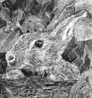
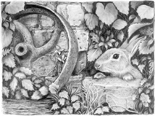
"Mike, thanks for a great seminar Tampa last month. the attached drawing is my completed, you have to know when to stop, rabbit drawing. Drawing this much detail at such a scale is a real challenge and teaches one that patience is required."
 Not easy - I know - especially patience! But this was designed to stretch everybody's abilities. It deliberately contains many textures requiring different approaches, but it's achievable when tackled one texture at a time. And none of the areas of texture are particularly large.
In many respects, this is superb! I did slightly darken the mid-values of your scan because I doubt it's as light as it appears to be. That increases the overall presence but, adjusted or not, every area of texture reads correctly.
Due to the high degree of detail, I do think the rabbit loses it's place as the main focus. However, I strongly believe that you have to go through this detail stage before you can better appreciate when and where to play it down. I liken it to a clown on the high-wire. He might look foolish but first he has to be a master of his craft. So you have to master detail before you can begin to play games with it. In this case, I can't fault your detail at all.
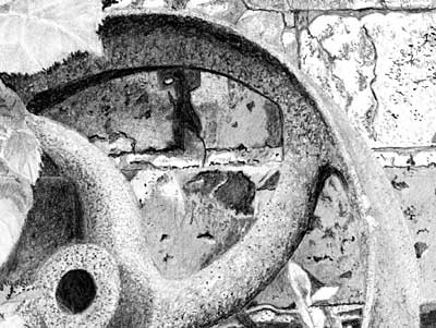 My definitive test for any texture is to mentally run my fingers over it. I can literally feel my fingernails catching on the sharp-edged pits in your rust. The working surface of the rim feels smoother, as it should, being worn down with use. The leaves feel smooth, and they contain subtle detailing and three-dimensional form. And the bricks are solid and relatively smooth.
Each texture is quite distinct and separate from the others. The smooth bricks, for example, increase the roughness of the rusty wheel. The two contrast to the benefit of both. And your mortar looks gritty without it looking like rust. But, of most importance, your slow, deliberate, and patient approach has produced a wonderful clarity. Everything is sharp and clearly defined.
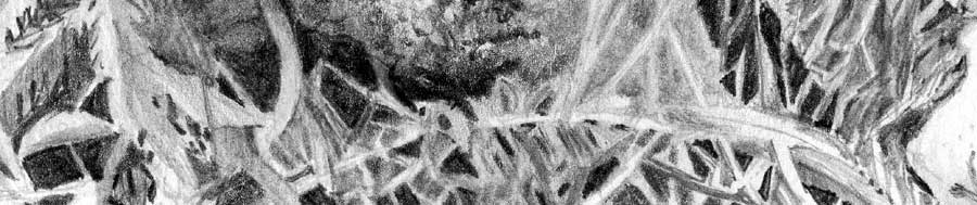
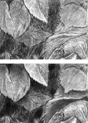
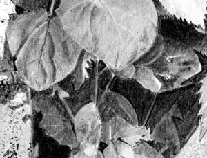 This area works remarkably well but it could be improved. You've lost some depth because you're background blacks are not solid. They are black but they contain light pits and gaps. That light content affects the way we read the area - we see an average value based on the mix of light and dark. Remove that light content and your background will noticeably recede. That gives you a greater opportunity to create more layers within the midground foliage that visually increases the depth even more. I am of course nit-picking. Your leaves are well-sculpted and believably three-dimensional, although there is one omission. The top left-hand leaf is casting its shadow on the brick. If that leaf had a shadow cast on it by the leaf in front, that would immediately separate them and create yet more depth.
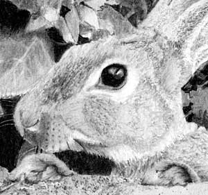 Your rabbit is delightful! Its wonderfully dark eye and bright key highlight readily attracts attention to it. The rabbit is not only hairy, it has a variety of textures within the hair. That's something often overlooked by artists who attempt this drawing.
As I mentioned earlier, I imagine running my fingers over each area before I begin drawing. That helps to identify the shorter hair on the ears, the coarse dark hairs on the muzzle, and the softer hair on the cheek. Looking at your drawing I can easily identify all three.
This foreground area shows good use of negative drawing, but the same advice applies to this as I mentioned in the top right foliage. Take a look at a clump of grass and you might be surprised how intensely dark the holes are. Darken yours and you'll be able to push some blades so far back into the shade that they almost disappear. Others can be on an inclined plane, which leads the eye in and connects the layers. The structure is good but you could do more with it.
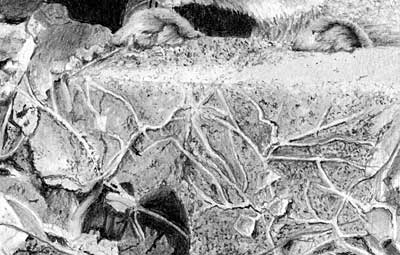 Finally - and I believe this is the first time I've been prompted to comment favourably on this element - the concrete block the rabbit is leaning on is super!
Like your bricks, it has subtle but clear three-dimensional form, the stone texture is unmistakable, and the dead ivy clings to it very naturally.
Overall I think this is a lovely drawing that shows the patience and attention to detail you put into it. Thanks for joining us at Clearwater and I really enjoyed working with you.
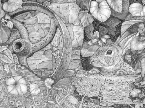
Quwatha (Florida workshop - August)
"Oh, Mike, I have so much to learn and to practice. I know there are lots of things wrong with this drawing. It looks worse when I photograph it and look at it in PhotoShop. No matter, I would appreciate your critique."
 There are improvements you can make but it's not nearly so "wrong" as you seem to think it is. And drawings always look worse on a computer screen - it shows up every flaw that the human eye doesn't usually notice. That said, it's a good tool for seeing where improvements can be made - as long as you don't let it dishearten you.
My overall advice is to slow down. The only areas that are of a lower quality are the result of not thinking about, or studying, the area before you commenced drawing. You probably didn't give yourself the time to do that thoroughly.
Also, you might been too focused on the area in which you were working. Sometimes you have to stand back and look at the overall effect. In this case I think your focus has lead you to draw almost every area with similar values. You have strong darks and bright highlights but the multitude of similar mid-values overwhelm them.
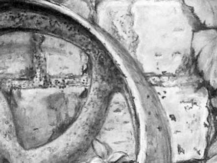
 This is, in my opinion, the best area. The leaf has structure, detail, and form. The rusty wheel contains rich darks, against which you could adjust all other values, and a truly rusty texture. It's sharp-edged and gritty. I mentioned during the workshop the mental action of running your fingers through hair or dragging your fingernails across rough surfaces. I can "feel" my nails catching on all the pits in this rust - along the rim and the spokes right down to the boss.
 The bricks behind the wheel are relatively smooth and solid, which contrasts well with the rough rust. They serve to exaggerate each other's surfaces. The bricks contain interest too without it being a distraction.
However, from that area onwards I can see a desire to finish - too quickly. The lower brick in this section, for example, is already becoming a rather loose representation of texture you created in the bricks above, with visible linear hatching. The same applies to much of the drawing.
 Moving across to the top right area - you've kept those edges wonderfully sharp. Remember, soft edges merge adjacent planes; sharp edges separate them.
Those edges could have been used to create a great deal of depth. Unfortunately, you lost that opportunity to some extent. Your darks are definitely dark but they're not solid. The result, as decoded by our eyes, is a mix of blacks and light gaps that create an overall dark grey.
You've also not thought about how each leaf will affect those around it. I'm referring to the casting of shadows. They are incredibly powerful devices for creating depth at different levels.
When one leaf casts its shadow on another we instantly understand the relationship between them - that one is more forward than the other. And other shadows can be used to tip leaves onto inclined planes - one end in the light, the other receding into the shade. My top left leaf does that to some extent. They not only create depth, they also link all the layers in the overall depth.
Again, I think you worked at a speed that didn't allow you the time to think about these things. If you work each leaf independently you will gain a better understanding of that leaf, but you do have to think about its interaction with elements around it too.
 The rabbit is delightful! It has a wonderfully dark eye and a muted reflection at the top. And the key highlight is pristine white. That's excellent! It has real attention-grabbing power. A white key highlight adjacent to the black pupil always places the maximum contrast in the entire drawing in that one spot. It's almost guaranteed to catch the eye of every viewer.
The rabbit is definitely hairy, although it has the same texture throughout. Again, imagine running your fingers over each area before you commence drawing. Personally, I like the strong dark hairs on top of the muzzle, which you've used well, because they contrast with the softer hair of the cheek, which you've omitted. Like the bricks and rusty wheel, they boost each other's textures. The ears I think have shorter and possibly softer hair. And the body is covered in a mass of guard hairs, which I would remove, because they are a distraction. Whatever texture you considered each area to have, you ultimately used a single texture for all. That's not necessarily wrong; it's just your vision and not mine.
Congratulations on noticing that one paw was a copy of the other (there was only one visible in the reference). You've made a good job of making them sufficiently different. And I really like the wooden log the rabbit is standing on! It makes a pleasant change from the concrete block in the reference :)
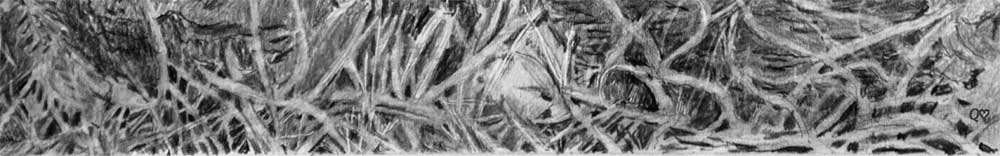
Finally, there is a lot of good work in the foreground area. You've used negative drawing very well in creating the grass. My only advice is to not be afraid to push some blades so far back into the shade that they almost disappear. Then let others step forward. Perhaps place some on inclined planes, as I explained with the leaves. You have created a good structure but now go back in, imagine what you might see in there in real life, and recreate that - layers that recede back into deep shade.
As I said, this is much better than you possibly think it is. It just needs a slower and more thoughtful approach. This is your world you're creating and you have to give yourself enough time to live within it. Do that and it will possess the sense of reality you are experiencing.
Cherin (Ottawa workshop - August)
 You submitted a photo and I've done my best to correct the exposure. I've returned the background to white, and adjusted the values in the right-hand half to match the darker left side. Correct or not this is the image I'll critique for you :o)
 There is a lot of life and some good work in this. But there are areas that could be improved. I'll begin left and work right.
The nose has some form but it doesn't quite achieve a realistic look. Unless a dog twitches its nose, which isn't often, you can always check the horizontal edges by comparing them to the eyes. The top of the nose will be parallel to a line drawn through the eyes - they should be at the same angle. Yours is, as are the nostrils, but the base is tipped upwards at the right. Also the front of a nose is near vertical and the top almost horizontal but you haven't differentiated between the two. Even if it looks flat in a reference I'd still exaggerate that change in plane - most probably by creating highlights on the top surface. That also gives you the opportunity to show that the top has a different texture to the front - broken into small islands as opposed to the lower smooth leather.
The muzzle looks really good, as do the areas around and above the eyes. However, slow down a bit. Many of your marks are blunt-ended, hooked, or off course. None are overtly distracting but they combine to suggest a rather rough appearance.
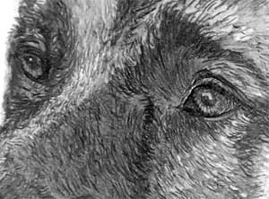 The eyes are bright and alert, and that difficult rear eye looks perfectly realistic. The bright highlights draw my eye to them immediately, although you could have dulled the right-hand eye's reflection and brightened the key highlight, so they were sufficiently different. That would have created the maximum contrast in the entire drawing within that eye - key highlight adjacent to the pupil - to really attract attention to it.
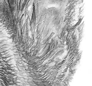 Moving up to the ears... they both look good. You've subtly suggested the internal cartilage; the hair has different textures in all the right places; and they contain depth. I see you tried indenting within the right-hand ear, which tends to work well in areas of high contrast, but the interior of that ear is a little too light to gain much benefit from the indenting. You have dark hairs in front of a light ear, which can work. But your dark hairs need to be both dark and sharp. If they're soft-edged they won't stand forward of the back of the ear. Personally, I would have used negative drawing for that area; lighter hairs at the front; and a darker interior at the base. That would create the sort of depth where you feel you can poke your finger down inside... not that I'm suggesting you should try that. Far too risky!
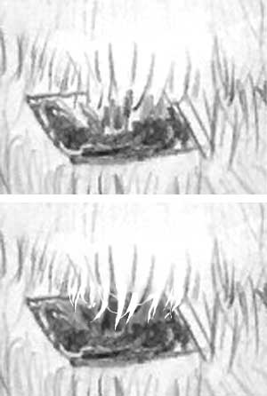 Dropping down again, I'm not going to comment much on the mouth. It's a tricky area to draw and I think your result is adequate for its purpose. The tongue is rather loosely drawn but the gum detail draws my eye away from it.
You left the collar in place, which does require negative drawing. That creates sharp-edged foreground hairs so the collar recedes, which can create a lot of natural depth.
Draw around the hairs you want to leave in the foreground. Then darken the collar sufficiently to expose the edges of the hairs. They can then only be read in one way - light hairs in front of a darker surface.
The darker drawing at the left of the neck nicely balance the values of the head above. Those on the right are more muted and serve to create both recession and avoid that area being a distraction. The empty central section might be a partial result of my value adjustments so I won't comment on that.
Finally, this is a lovely Shepherd and well-drawn. You've captured both its warmth and character, and I think you should be justifiably pleased with it.
Debbie (Drawspace online - Advanced)
"Very simple composition but had plenty of practice moving, flipping, sizing etc"
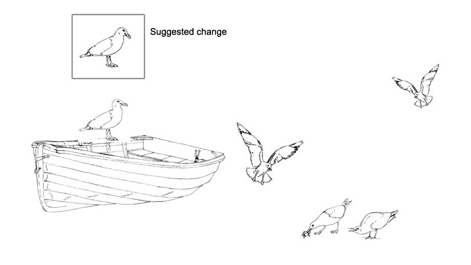
...and the practice is all that matters. That said, this works quite well.Everything points towards the focus of interest - except for the gull on the boat. I find that slightly distracting, but that gull is easily altered to conform to the focus. Just cut off the head, rotate it to suit (CTRL+T), and reposition it. I also copied the back of its neck, rotated it, and used it to join the head back to the body.
"Oh my goodness, that is amazing. You're right it was not quite right, as were the other birds, but I wanted something in to tie the boat to the rest of the picture and that seemed the best option. I had no idea that you could do that. Back to do some more experimenting."
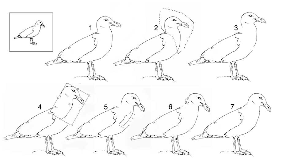 Here you go - something for you to try:
1 - Gull reversed : Edit > Transform > Flip horizontal
2 - CTRL+L for Lasso
Draw around area you think you want to move.
Right-click > Cut
or
CTRL+X (cut) then CTRL+V (paste)
Both will place the head on a new layer
Right-click > Cut
or
CTRL+X (cut) then CTRL+V (paste)
Both will place the head on a new layer
3 - The head separated on new layer
4 - CTRL+T (Transform). Rotate to where you want the bird to look.
5 - Hit "V" (Move). Move the head to its new position.
CTRL+L to lasso part of the chest.
Then Cut and Paste (as above) on to a new layer.
Then Cut and Paste (as above) on to a new layer.
6 - CTRL+T and rotate the chest line.
"V" to move the line to complete the chest.
You can use the arrow keys to nudge it into position.
CTRL+L to lasso part of the neck - this time COPY it...
CTRL+C (copy)
CTRL+V (paste)
You can use the arrow keys to nudge it into position.
CTRL+L to lasso part of the neck - this time COPY it...
CTRL+C (copy)
CTRL+V (paste)
7 - Move the copied line into place. To make it fit I had to:
Edit > Transform > Flip vertical
CTRL+T (Transform) - rotate it to required angle
"V" to move the line to complete the chest.
You can use the arrow keys to nudge it into position.
CTRL+T (Transform) - rotate it to required angle
"V" to move the line to complete the chest.
You can use the arrow keys to nudge it into position.
At any time you can use keyboard Z (zoom): drag a box around the area you're working on to enlarge it.
To go back to the former size:
CTRL+- (CTRL and minus) makes it smaller
CTRL++ (CTRL and plus) makes it bigger
CTRL+0 (CTRL and zero) makes it fit the screen
CTRL+ALT+0 (CTRL and ALT and zero) makes it its actual size (100%)
I hope that helps.
Elaine (Studio Foundation Plus workshop - April)
"Thank you for the workshop Mike. I learned such a lot over the weekend, and cannot wait for the next one! I am trying to work on understanding forms and shadows, and to do less and less copying now!. I have kept going back to this drawing, as I can see so many faults - such as unsharp edges, and visible outlines. Trying to change things seems to make it worse, so I will leave it like this for now."
 This is looking good, Elaine. Very good in parts, and other parts could be improved on - bearing in mind that I can only base this on the image you supplied.
As usual, I'll begin top left and work my way around. The top left leaf is so obviously forward of the wheel, greatly assisted by its excellent sharp edge. As my eye travels down that side, below the wheel's central boss, the sharpness becomes progressively less apparent. The contrast markedly diminishes too. As a result, the lower leaves look flat, as though they're pasted on to a surface, because no depth occurs between them. The central foreground foliage regains the contrast but, again, the edges aren't sufficiently sharp to divide them from their background. Just remind yourself that soft edges merge adjacent elements; sharp edged separate them.
 Moving back up to the wheel, a similar set of circumstances exists. The top is dark, contrasty, has good three-dimensional form, and the textures are definitely those of a rust-pitted surface. Lower down it becomes hazy and less distinct. That might be due to this being a photograph (I'm assuming it's a scan) that isn't doing your drawing the full justice it deserves.
Your brickwork and mortar are near-perfect. The bricks have sharp, hard edges, and not so many holes and surface flaws that they become dominant. You've also exaggerated the lighting to add a narrow highlight to the lower edges of the major holes, making it obvious each has depth. There are subtle shallow indentations too that add a sense of reality. The gritty mortar has a texture that is definitely not brick-like. You've successfully found two different techniques to differentiate brick from mortar.
"I tried to be a little creative, by not including the rock in the bottom left, but I am not sure how well this has worked.
I think you creativity does you proud. I've already mentioned the flat appearance of this area, but not yet remarked on the wood below it. It's wood! It couldn't be anything else. The right-hand end has believable splits and ragged ends. The body of the wood has a lovely weathered appearance, which would have benefited from greater contrast, but it does look good. Moving across the right-hand side... The leaves are very well-studied, and executed with lovely subtle attention to detail and form. They cast shadows on each other too, which creates layers and depth. The background is perhaps less successful. It has interest and a degree of mystery - not everything is understandable, which is entirely natural - but it lacks absolute depth. By that I mean it doesn't include sufficient solid, black areas to tell us "this is as far back as you can see". As a result it all tends to become midground. The darker those depths are the further back you can push some elements. Many of your midground and background elements use values that exist in the foreground too, which serves to limit the perceived depth.
 It doesn't need much - just a few key areas of black to define the absolute background. Then everything springs forwards to the midground, and you have the opportunity to darken some to form a midground/background bridge. That leads the eye back into the depths.
The changes I made are quite minimal. I removed the lighter content from a few dark areas - I didn't darken the darks themselves - and then I was able to push a few elements further back into the shade. If you choose your black areas carefully you can usually engineer one or two to be adjacent to the edge of a foreground leaf, which creates lots of contrast and pops the foreground leaf further forwards.
 Your rabbit is a little soft but delightful! It has texture - and no whiskers, but I can forgive that. More importantly, it has a strong black eye with a bright white highlight that draws attention it. Overall, I think your choice range of values used for the rabbit are rather light. That results in some loss of three-dimensional modelling, but not too severely. However, it also diminishes the various textures, from the dark guard hairs on top of the muzzle to the soft downy hairs on the cheek. And your rabbit has ears that match its face, where a real rabbit has relatively short hairs on its ears. However, that's your interpretation and your vision.
Speaking of interpretation: it was obviously based on a clear mental picture. That's reinforced by your treatment of the rabbit's feet. If you'd copied the reference both of its feet would have looked unnaturally similar. Only one foot was visible in the original reference so the other is an actual copy of the visible one. But, because you were drawing what you understood, rather than blindly copying the reference, you've naturally produced a perfectly acceptable and realistic pair of feet.
Finally, the block the rabbit has it's paws on... many artists find it troublesome, but not you. It has lovely, understated texture; a sound sense of three-dimensionality; and it fits the scene perfectly. The "foliage" growing over it was actually dead ivy, but you weren't to know that. Your long intertwining leaves are a good substitute, although none cast shadows on others they cross. Considering this was a drawing that was intended to stretch your abilities into new areas, I think the result is something you should be very pleased with.
Maddy (Studio Foundation Plus workshop - April)
"I finished the work from the foundation workshop. There are a lot of glaringly obvious mistakes!!! My eye got very confused with the bit at the bottom and I struggled to focus on parts of it. I couldn't make myself decide how to work it and then kept getting distracted by other leaves etc..."
 I give a lot of weight to my first impression. In this case, it's that your drawing is lacking depth and, in some areas, an understanding of what you were trying to draw. The latter applies more to the foreground; probably because it required some invention. I'll admit that was part of my devilish plan :)
I'll begin top left and work my way around. You made a very good attempt at the textures of the rusty wheel. There is one major fault, which I'll return to, but the textures are quite realistic. Before you draw anything, mentally run your fingers over it. If it's hard and pitted, such as this wheel, drag your fingernails over it too. Can you feel them catch on the steep-sided pits? Good. Now you know what you're about to draw. And those pits, coupled with a low-reflective surface, are what we recognise rust by - given that this is monochrome so we can't use rust colours.
The major fault I mentioned is one that appears throughout the drawing - outline. Nothing in life has a line around it. We see edges because of changes in value. If you feel the need to use an outline to separate two elements, then your shading needs to be adjusted, even if that requires some exaggeration. Stretch the contrast until it provides the separation you need.
You can use sections of outline in places if you need to - and where it might represent an edge curving into shade - but banish outline as much as possible.
Your foliage, left and right, is good, and your edges are sharp. That's ideal because sharp edges separate elements and planes, and soft edges merge them, as if they are somehow connected. You've even incorporated cast shadows, although you really need to study them in Nature to understand them better. Shadows are something we instinctively understand so rarely look at them. They convey an enormous amount of information, so teaching yourself to use them effectively is never a waste of time. Just fix the direction of light in your mind and then apply it to everything you draw. Just ask yourself "Can this point beneath my pencil see the light? Only partial light? Or no light at all?" For example, you've used light remarkably well within the axle hole in the wheel's central boss. I can see you understood it in three-dimensions and shaded it to reflect that. Do the same for every other element in the drawing.
I'm going to skip over your rabbit because it's lovely (ignoring the obvious outline!). It's basically very sound and there's nothing that practice won't improve on. The foliage is well-drawn too and contains depth. But I think you've over-thought its background. You have plenty going on in the depths but too much. That resulted in no areas of pure black. The blacks tell us "this is as far back as you can see". Without sufficient black areas we lose that reference and understanding. As a result, the intended depth is greatly reduced.
This is a fairly sunny scene and everything will cast a shadow. I'm not suggesting you draw every shadow - far from it, that will over-complicate - but shadows combine to form areas of shade. Create more grass and foliage and then holes that lead right through to the deepest shade. That will broaden the range of values available to you. Never be afraid to really push some elements right back into the shade - so deep they almost disappear. That is entirely natural.
When you're working on areas like this, work from the background to the foreground and imagine what you might see in there. Believe you are pushing your pencil deep into those depths and draw what you think you might see in real life. The chances are what you see won't be understandable, which exactly reflects Nature - but do keep all your edges sharp. You're creating overlapping layers, so you need clarity, or it might become one muddied mess. And don't forget you can always change your mind and use Blu-Tack to pull anything forward again.
I really enjoyed the April weekend. Thanks for being a great teacher and kindly giving us your hard-earned knowledge with a smile. I learned a lot. I am trying to make myself be more confident to make the darks darker and the lights lighter i.e. more contrast for greater depth but it is taking time!
Element by element, this has a lot of good work in it. I can see you lost the plot in the foreground :), but carry what you learned on to the next drawing. Do think about shade and shadows, and develop the courage to introduced lovely rich darks, so you create a lot more depth. I know that can scary at first, but I introduced you to Blu-Tack so you do have he means to reverse a decision if you need to! Thanks for joining us, Maddy - we really enjoyed your company.
Mark (Studio Foundation Plus workshop - 2017)
I have finally completed my second drawing since the workshop. Slow, but enjoyable! I would appreciate your critique of "Harvest mouse on a poppy seed head". On the whole, I am pleased with it. The top of the seedhead was a struggle. The light was from above on the original image and the fluted parts were partly translucent.
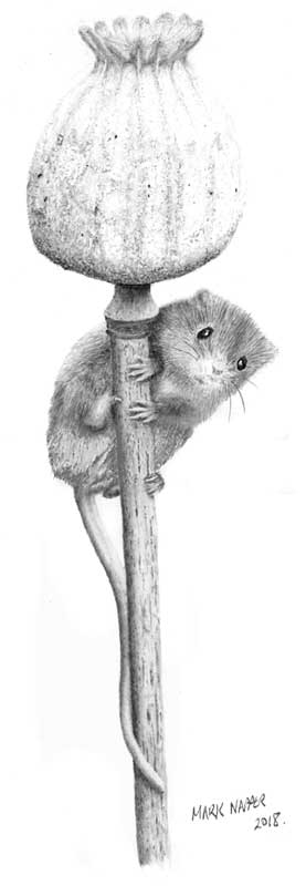 Overall, I like the result. I hope the image here properly represents the one you drew. Your multiple scans left a gap across the mouse, so I used your photo, suitably adjusted, to fill it.
Overall, I really like this. It shows the diminutive size of the mouse against the poppy seed head; its bright eyes attract me to it immediately; and the poppy doesn't attract attention away from the main focus. There is little that I think could be improved, but there is one source of assistance I want to mention.
The little mouse is sharply drawn with good three-dimensional shaping. The placement of its feet - especially that single claw on the hind left-hand foot - give a totally natural sense of it clinging on to the stalk. And I think its expression is perfect - as though it's just noticed us and is really unsure of its next move.
You mentioned not being happy with the troublesome seed head. I don't think it's in any way substandard. In fact its less-defined appearance forces more attention onto the mouse. However, there is a simple solution whenever a reference is lacking essential detail - as long as it's a known and identifiable object.
You probably can't find a poppy's seed head, in this case, when you need one. So use references and illustrations from books. Search the Internet too for similar images. There are often countless sources available.
The original reference will give you the outline and the internal structure with the correct perspective. Now rebuild it using the information garnered from elsewhere. You're not copying, and not infringing any copyrights; you're simply extracting the information you need and incorporating it into the body of the original reference.
You omitted the background. A good choice, in my opinion. I have a basic personal rule: if the background adds nothing of value to the story, omit it. Including it simply adds confusion.
This is a lovely drawing of a delightful and timid creature. You should be very pleased with it - even if some parts are not as you'd hoped they might be. But, remember, only you know that. Everyone else will enjoy your drawing in the way they personally see it.
Jennifer (Drawspace online - Intermediate)
I was having trouble getting excited about spending many hours working on Henrietta and the thieving dog, so instead I did a portrait of my (now deceased) whippet, Maestro.
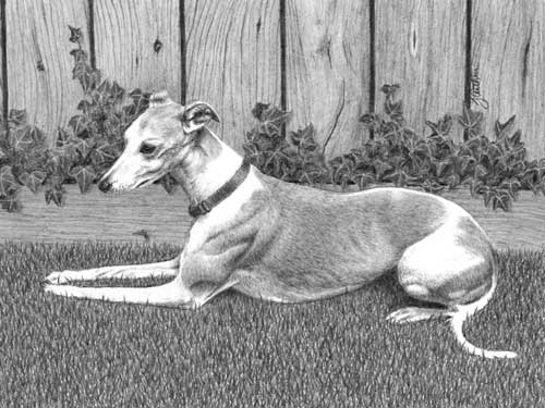 Probably a wise decision. The elements are similar - wood, foliage, grass and dog... but no chicken!
Overall, this works well, although there are a couple of things that don't sit too happily with me. I'll begin at the back and work forwards.
The wood of the fence is nicely pitched: it contains detail but remains a secondary element. The knots, splits, and variety of grain add interest and realism without any of it fighting for attention with the primary character. I'm not certain if the base board is forward of the fence and forming a bed for the plants, or if it's ivy growing through the gap between the two. In either case, it's not important to the composition's success.
The ivy (I'm assuming that's what it is) could contain more depth, and have fewer repeating patterns. Almost every leaf is facing us and displaying the same formation of light veins. It's not a huge distraction, but its sense of reality suffers a little. What I do find distracting is the composition of the foliage to the left of Maestro's head. My eye tends to travel along his spine, up his neck, and across his head to follow the sweep of foliage that takes my eye up and out of the frame. Repositioning that foliage slightly lower, so Maestro's head and ear cut through that line, would prevent that journey occurring. The extreme left-hand mass also attempts to drag my eye out of the frame. On close inspection, it's the single large lower leaf that's causing that - because it's quite dominant and so obviously continues outside of the picture frame.
 My first reaction on seeing this drawing was that the grass looks flat and lacks recession. I think that's probably the result of the white content throughout the area. If you reduce it towards the back, the eye will be attracted to the foreground "highlights" and be drawn back into the drawing. And further back, grass will shade grass so less highlights should occur.
Also - and I'm really nit-picking - the grass appears to be mown but to still have some depth. I expect Maestro to sink deeper into it, yet the few blades that overlap his legs and body suggest he is on the surface - or the grass is shorter than it appears to be.
Maestro is looking resplendent on the grass! He has good three-dimensional solidity, a subtle hint of rib cage, a very believable hair texture, and I suspect the white areas are more detailed than they appear to be. Domestic scanners most often fail to capture the lightest 10% of values. His collar is nicely played down. I would have preferred to see some sharper drawing in that area, but that's just personal preference. His head says it all. He has a dreamy expression, partly generated by the dim highlight in his eye, and the underlying bone structure is suggested very well.
The drawing of the Hooded Merganser actually received a couple of awards: It was selected for display at an exhibition of artwork here in San Francisco, and was also chosen as one of about 115 winners in the international Strokes of Genius 10 drawing competition.
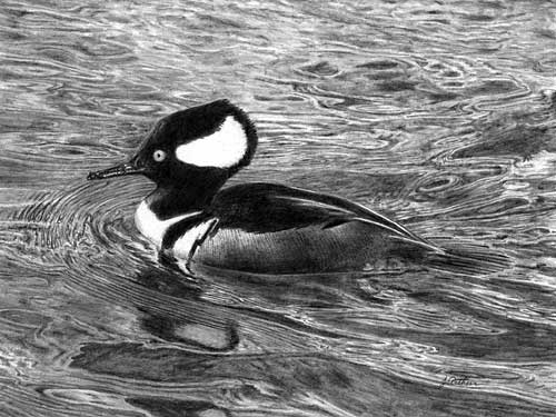 As you graciously supplied this, and because I greatly admire it, I wanted to include it here. It contains the sharpness of detail, and the superb use of contrast that Maestro would have benefitted from. It's no longer a drawing but an experience. And it has wonderful recession and focus.
You've developed so far in the two years spanning the drawings, and if I helped with that development in any way, I'm profoundly pleased.
Mary (Drawspace online - Advanced)
My computer composition for the Advanced Class.
This class gave me wonderful building blocks on which I can continue to build and develop as an artist. Thanks for a great class!
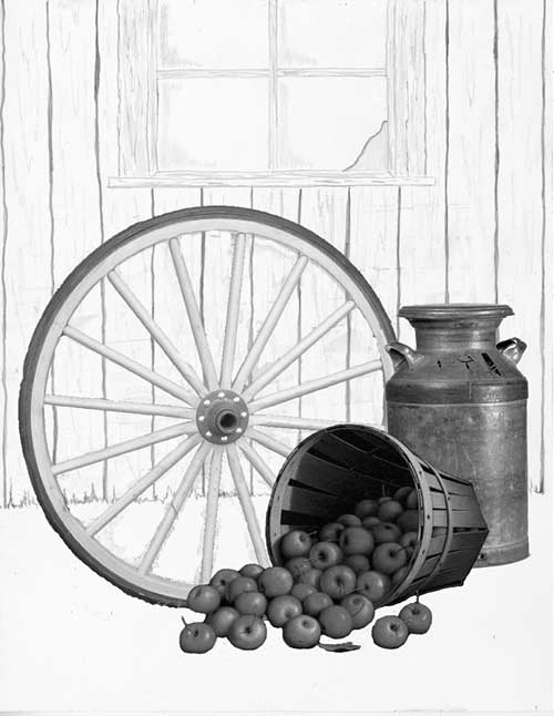 This is a good arrangement, Mary, and, as you discovered, it's a breeze in Photoshop. The ability to resize, move, flip, turn elements off and on, all makes composition so much easier. And you receive an instant visual impression of the final work.
I should have mentioned the ability to mix sources too. Your wheel, basket of apples, and churn are all photographs, but your background is a rough pencil sketch. It could just as easily have been a Photoshop-generated line drawing from yet another photo. The sourcing possibiliies are endless.
There's good balance in this, coupled with an interesting journey for the eye. I find myself beginning at the foreground apples. They lead my eye into the basket and from there to the churn. The wheel then swings me around to the start point.
The background might not have worked if you hadn't removed a part of the lower right pane. That breaks up the symmetry - avoiding the patterns the human brain loves to detect - and the angle of the break points me back down to the wheel. Overall, I think this would make a very pleasing drawing.
Kara (Drawspace online - Beginners)
Well, Miss Kitty and I have spent the better
part of the past 2 weeks in the company of one another. But, I believe it is time that she and I part ways and move forward.
You intended this assignment to be a stretch, and a stretch it was! There were 2 challenges in particular for me: first, I have never attempted to draw hair or fur before, so that is quite foreign. Second, I look back at the end result here and am still a bit perplexed about the best way to approach this drawing. My initial thought when reviewing this is that Miss Kitty is overly detailed -- but then again, figurines by their very nature are over-detailed, which makes composing a drawing strategy here challenging indeed.
You intended this assignment to be a stretch, and a stretch it was! There were 2 challenges in particular for me: first, I have never attempted to draw hair or fur before, so that is quite foreign. Second, I look back at the end result here and am still a bit perplexed about the best way to approach this drawing. My initial thought when reviewing this is that Miss Kitty is overly detailed -- but then again, figurines by their very nature are over-detailed, which makes composing a drawing strategy here challenging indeed.
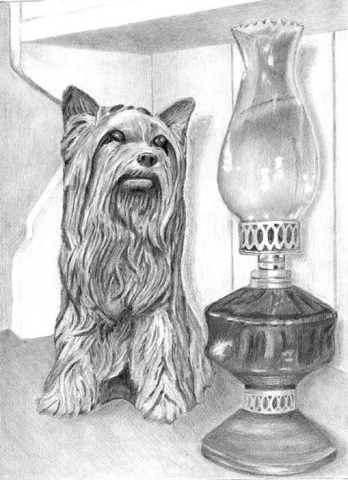 It was intended to stretch you, and it included elements that I hoped you had not tackled before. But I think you've achieved a remarkably good result. Once you realise the "hair" is a collection of peaks and troughs in a ceramic body, it is no different from drawing the lamp. I'll tackle each area in turn but, for now, this has solidity, three-dimensional reality, great textures, good observation, and a courageous approach.
The first thing I noticed about this drawing (I place a lot of weight on that first impression) is the superb three-dimensional rendering. Your drawing tells the simple story very well and Kitty is clearly connected to the lamp. The dresser top runs almost unnoticed into the background, and the background itself is nicely muted and devoid of interest, so it correctly appears to be behind the dresser. The dresser's curving end is constructed well, which is something many artists on this course have problems with. And the dresser itself is good too.
Kitty is the focus of the drawing so over-detailing is not a fault. She has bags of character, wonderful three-dimensional form, and she's decidedly ceramic and not hairy. In fact I think you've achieved just the right balance to state both "hair" and "ceramic" at the same time. Her rich dark nose and eyes draw my attention to her immediately. That said, bright sharp-edged highlights in her eyes would have been an improvement. Generating the maximum contrast within the eye would guarantee their position as primary elements. The thin highlight under her mouth is a great device for adding prominence to the jaw. The upward curve at the corners of her mouth, suggested by the shadows, give her a very warm and friendly appearance, and her attention is obviously focussed on the lamp.
I nearly omitted the cast shadows from a lack of confidence, fearing I would misdraw them and ruin the drawing. But, nothing ventured, nothing gained. I am certain that they are incorrect, but I am also quite certain you will
point out the error of my ways. LOL.
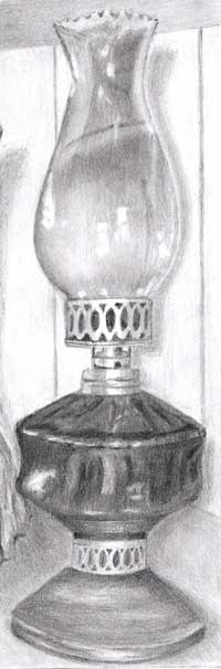 Kitty has a shadow that is lower than her height, so we can assume the light is shining from above. If the light was higher her shadow would be even shorter. The lamp also has a shadow that conforms to the same lighting source height but... the shadow has been cast from its base to its top as though the entire background is flat.
In reality the lamp is further away from the wall than Kitty is, so the shadow would travel back across the top and then up the wall, and be positioned further away and to the right of the lamp. Also, as the lamp is further forwards, the top of its shadow should be lower than Kitty's, but that's covered in the Advanced course, so now isn't the time to explain it :)
However, the human brain is quite capable of reading your intention without demanding complete accuracy. Even though it is incorrect, it doesn't greatly affect your drawing.
The lamp has both solidity and a sense of reality. The silky sheen on the brass collars and their soft highlights perfectly describe their round nature and satin finish. The receding cutouts correctly narrow and disappear around each side. Not noticing that is a common error made in this drawing - well done!
You've used a degree of artistic licence with the brass base and ensured its overall values don't equal those of the glass reservoir, which was an excellent decision. Your base and collars are definitely not glass and contrast very well with the harsher reflections from the glass. That's especially true as you've correctly used hard-edged reflections in your glass. We expect to see brilliant highlights with hard and sharp edges, and smooth surfaces. It's how we recognise glass - it's the predominant visual clue.
In hindsight, I also find the end product here
to be overly grainy for my personal taste. While I constructed most of this drawing with HB and 2H, the 2B and small amount of 4B that I added have introduced too much graininess, I think, and I'll likely use the latter much more
sparingly next time.
I agree but only in one instance - and there's an easy solution. The graininess doesn't distract except in the lamp's oil reservoir and chimney. We expect glass to be very smooth so visible grain creates confusion. There's no reason why you shouldn't use 2B or 4B for darker values - but, use it first. Lay down the darker value and then burnish it with the harder grades. The result will have the dark value with a smooth appearance.
Thanks again, Mike, for all the feedback in
this past course. It has been very enjoyable and immensely helpful, and I'm looking forward to meeting up with you again in a few weeks in the next class.
I'm looking forward to working with again too. This exercise was, as mentioned, designed to stretch you - to move you right out of your comfort zone. Your work on Kitty is superb! The lamp is good too and just needs a reversal of your shading layers. Hard over soft is always preferable, so the hard grades smooth the softer ones. Looking over my notes from the course, I think you've done exceedingly well!
Workshops UK
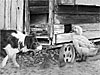
Tutorials
by Mike Sibley